After this I went to the Natural History museum and inspected the dinosaurs and the other animals on show. I felt a bit silly when I discovered, much to my sock, how small the Dodo really was. I was interesting to see animals of the past and how they lived and also present day creatures that you would not normally get the opportunity to see. I found all the interactive elements were useful to watch as they gave me a valuable insight into communicating a concept to a wide range of ages, in a fun, interesting and unique way. In doing this the learning process was made more fun and memorable. I think this is always worth baring in mind when working in the design world when it comes to captivating your audience.
Later on we went to Paula Scher talk hosted by the D&AD. I found this to be an inspiring presentation. Paula, like myself, came form a fine art background and progressed to work in the design industry. I found it fascinating how she had managed to encompass such a thing and really think I learnt a great deal from her works and encouraging words.
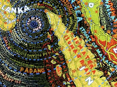
In my quest to progress my typography skills, I was particularly interested by her map work. It has an essence of Hundertwasser to it. I think this has been achieved through the use of a similar color palette and symmetry of shapes. I would like to have a go at encompassing hand rendered type into my work in a similar matter.

No comments:
Post a Comment